BRAND GUIDELINES
Our logo stands for the intersection of humanity and
advanced technology. It reflects our dedication to creating
intelligent, human-like robots that empower, assist, and
inspire.
The design captures our values of
innovation, precision, and responsibility, bridging human
needs and artificial intelligence for a better tomorrow.
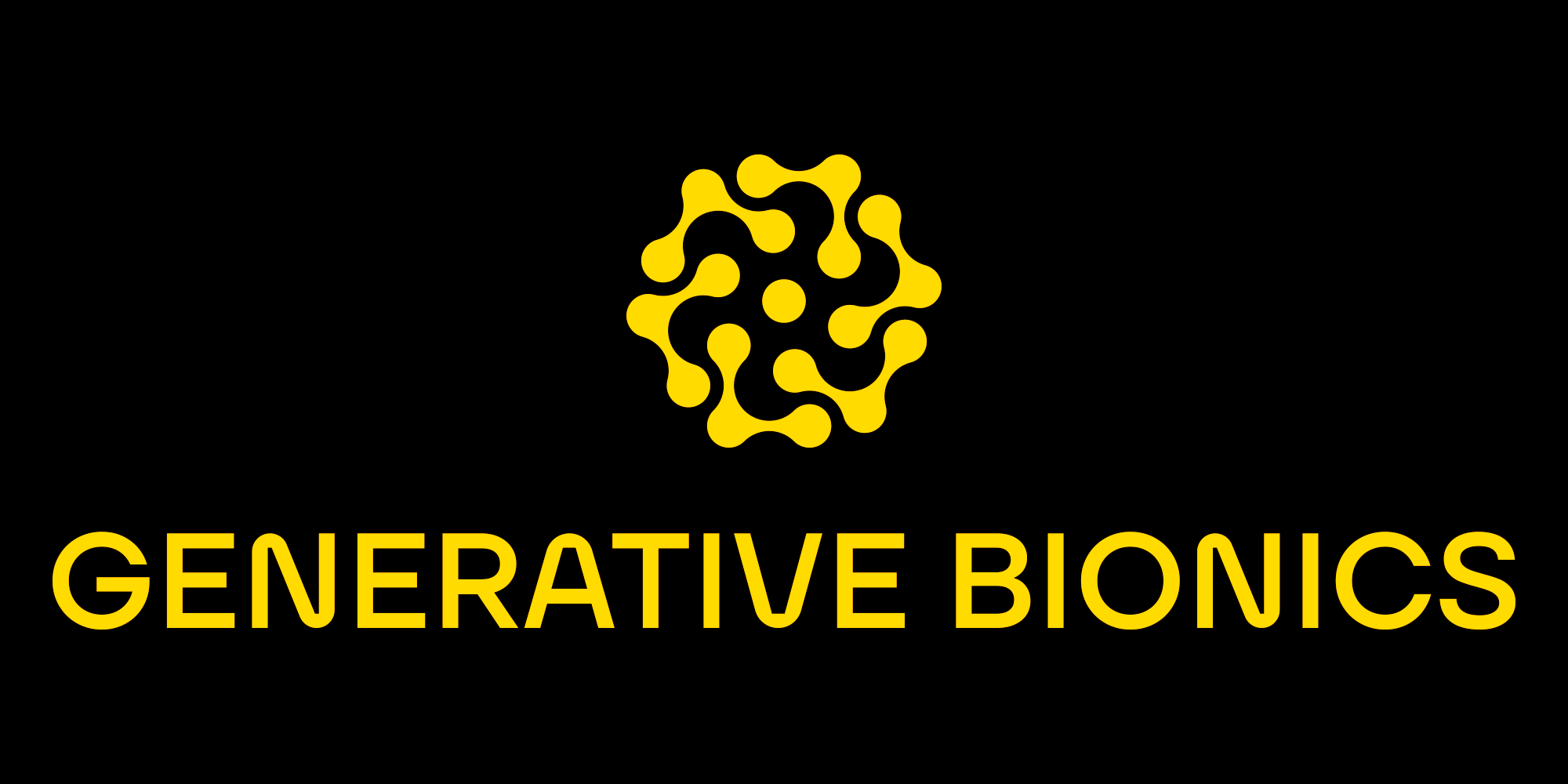
Pure Form, Pure Impact
Our brand includes three distinct logo variations crafted
for clarity and flexibility. Each is available in pure white
for dark backgrounds and pure black for light
backgrounds.
This straightforward color scheme
ensures our identity stays strong, consistent, and easily
recognizable in any context.
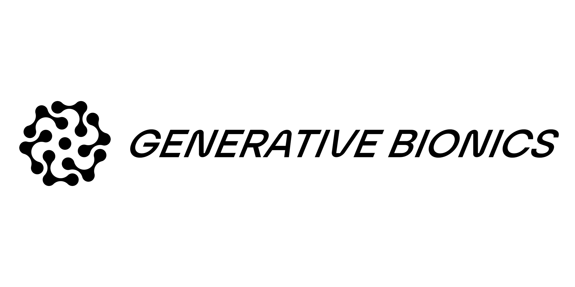
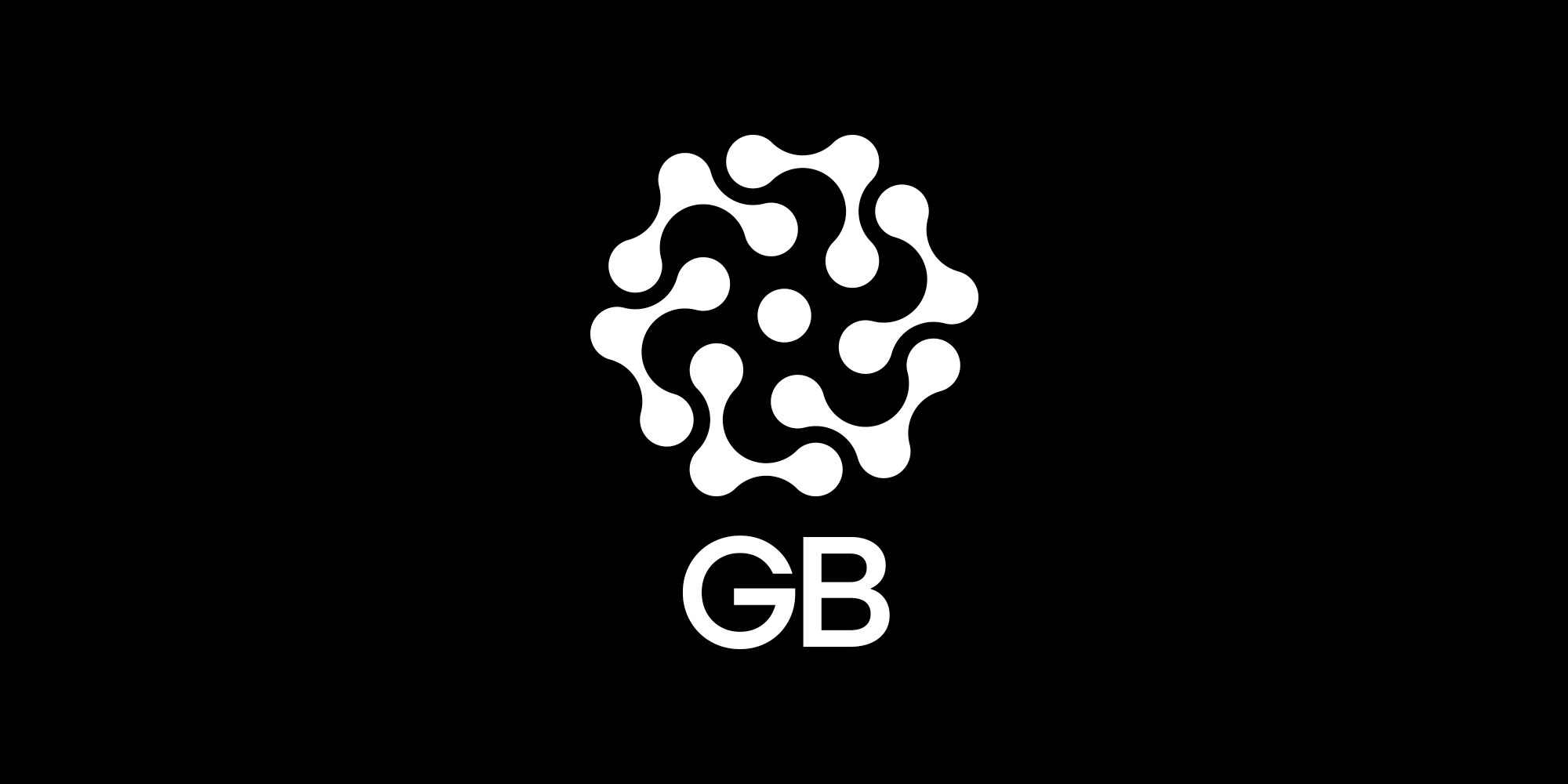
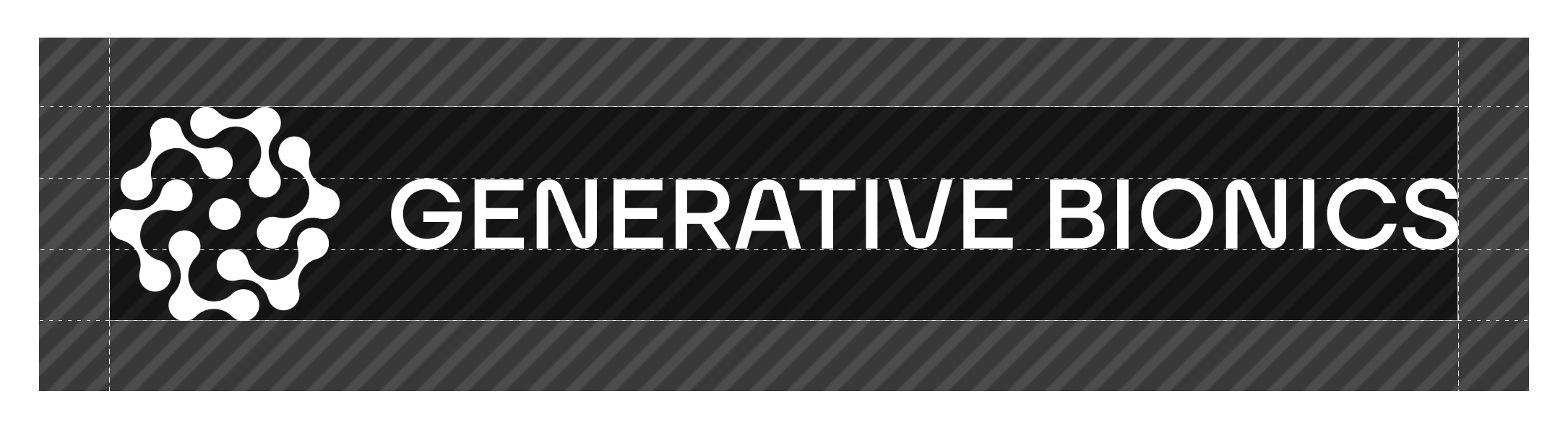
The logotype may be used by itself when flexibility is needed. The logo symbol by itself should be reserved for internal use only, such as on company-owned materials where brand ownership is clear.
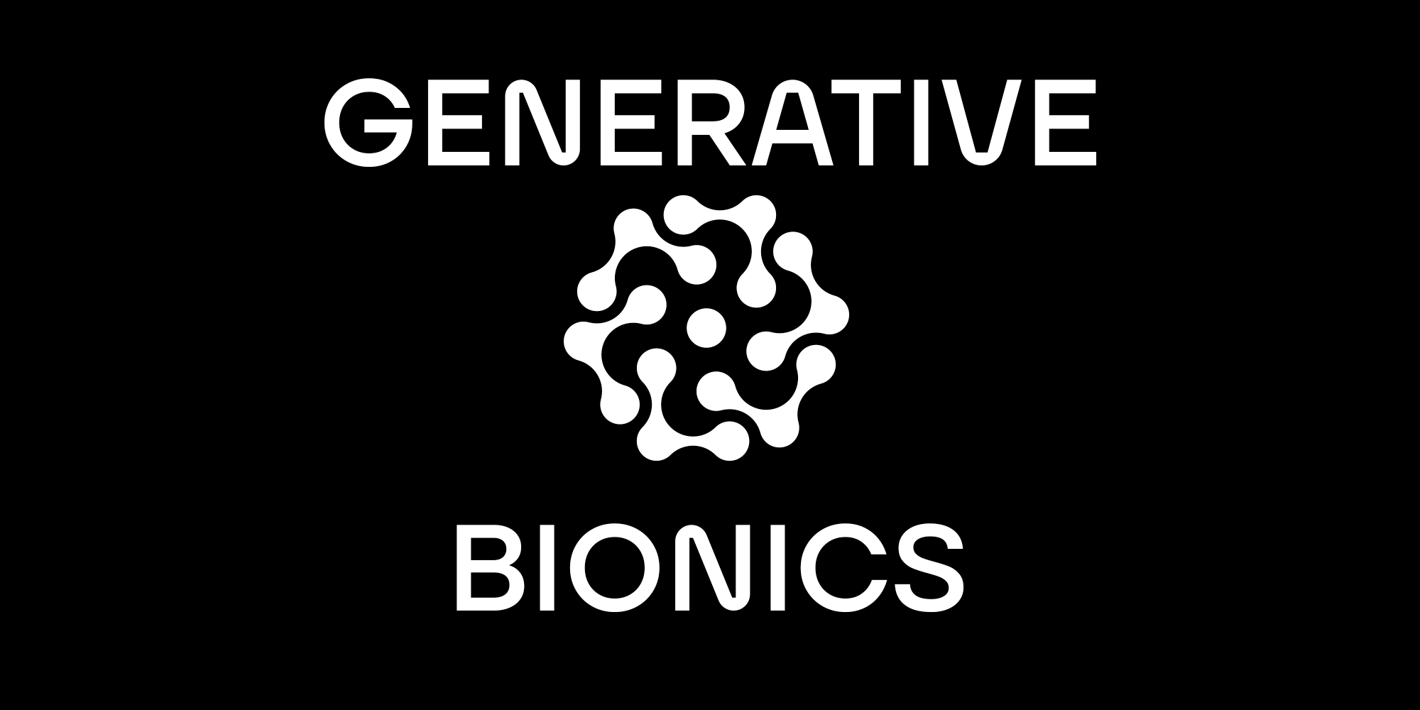
Clear Space, Lasting Presence
To keep our logo distinct and impactful, all versions
require a minimum clear space equal to the height of the
font used in the logotype.
This clear margin
applies horizontally and vertically and should never be
reduced below this measurement. Keeping this space free from
other elements preserves the logo’s clarity across all uses.
Unaltered, Unmistakable
To maintain the clarity and strength of our visual identity,
always follow these principles:
- Do not use the
logo symbol alone outside of company-owned contexts.
-
Only use pure black or pure white for the logo colors.
-
Avoid any distortion, skewing, or modification of the logo
or its parts.
- Use the approved wordings and element
layout exactly; rearrangements are not allowed.
- Don’t
add outlines, strokes, or borders to the logo.
- Always
use the full brand name; abbreviations are not permitted.